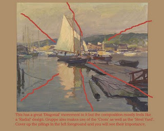
As promised in my last post, here are some examples of work by other painters along with some thoughts on how they composed them. This is a great thing to do with painters who you greatly admire. It is another way to open up your mind to the myriad of possibilities when it comes to composition. I'm still an avid believer that many good paintings can be made better with more thought given to composition. I include myself in this idea. Often times, I am excited by a subject and go with that first idea, but I always end up with a stronger painting if I take the time to make a few thumbnails first. I recommend coming up with a good plan first and then jumping into painting. Gruppe would always say that if students spent more time planning and drawing their subject, they would get better results. Charles Movalli once told me that when drawing in his big shapes, Gruppe would sometimes wipe out and reinstate an object even if he changed the placement by only a quarter of an inch to get the composition to work correctly. Now that's planning!
Here is a link. Composition of Outdoor Painting
If you click on the pics, you will get a larger image and the text will be more readable. In my workshop, I projected these images (and many more) onto a large screen and discussed them individually with all the students. It got them thinking about how they were going to compose their own paintings.
Now let's look at some paintings by Gruppe. Emile Gruppe was a master painter and a master Exaggerator. If you remember only one thing from this post, let it be this. 'Learn to Exaggerate' There is a Gruppe saying that goes like this. 'Overstate & Understate, don't ever tell the truth!'
Another note on the above painting. Gruppe REALLY wants the viewers eye to be directed to the main ship in this painting and to the smaller dories. He even went so far as to lean the buildings on the right of the canvas towards the boats! Talk about professional exaggeration! This serves the purpose of leading the eye but also helps to explain how STRAIGHT and TALL the masts of the ship are. Gruppe was also a master of explaining one thing for the sake of the other. Here he has the large ship, the medium dory and the small dinghy. The BIG explains the little and vice versa. But also notice how he knew when he had a good thing and didn't kill the effect. Imagine the building on the left leaning in towards the boats. We would feel like the world was coming to an end!


6 comments:
I just found your blog David. What great topics and posts! I like how you share your thinking and approach to the various subjects.
Thank you for writing it.
Your welcome Mary. I'm happy to be doing it!
Yes, very informative blog. I need to pay more attention to my compositions and lead the eye to the main interest. This will really help.
Thanks Tony. So glad that this will help.
I know that I am quite weak in the area of composition,but happily I found your blog this morning. I studied each example and am going to experiment with some of these designs. Thanks so much for sharing your knowledge, David!
That's great to hear!
Post a Comment